Bride's Project Redesign
UI/UX Design, Remote
A heuristic evaluation of Bride's Project's web platform in order to uncover usability issues, implement design improvements and produce a redesigned working prototype.
Project Overview
Working alongside a team of 3 other UX designers including Agnes Mak, Courtney Hill, and Joey Yao., I conducted a heuristic usability evaluation of Bride's Project's website and created a working prototype.
Heuristic evaluations are a method of finding usability problems in a user interface and involve having evaluators examine the interface to judge its compliance with recognized usability principles.
Project Type
Heuristic Evaluation
My Role
UX Researcher & UI/UX Designer
Timeline
1 Week
Tools
Figma & Photoshop
01/ Backgrounds
The Brides' Project is a not-for-profit organization dedicated to fighting cancer through the sale of donated wedding dresses. Since its inception in 2004, the organization has raised over $1.4 million for cancer charities by donating all profits from dress sales.
Despite its success, the website has been operated under limited resources, resulting in a suboptimal shopping experience for customers. The goal of this project is to enhance the website and improve the customers' shopping experience, with the aim of boosting sales and increasing the organization's ability to fundraise.
02/ Discovery
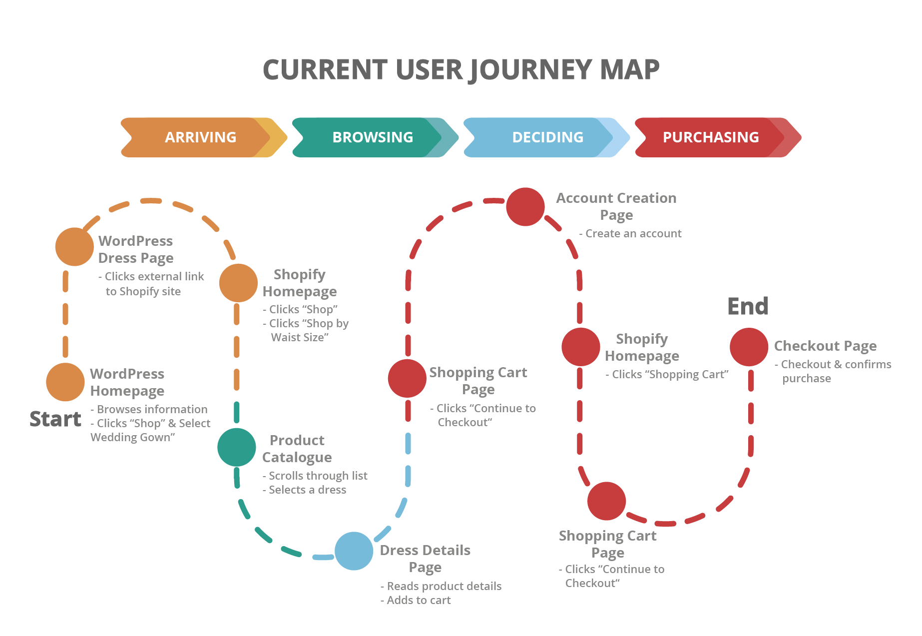
To define the scope of our evaluation and provide context, we began by crafting a scenario of a user looking to purchase a wedding dress on the website.
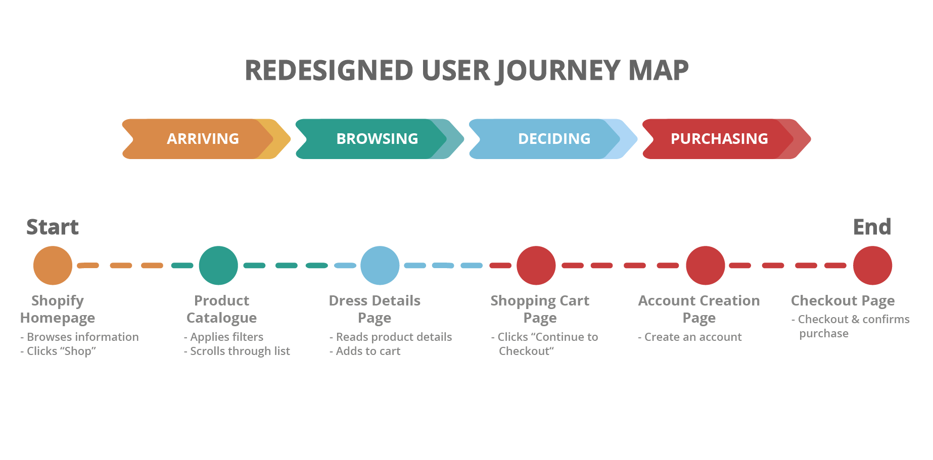
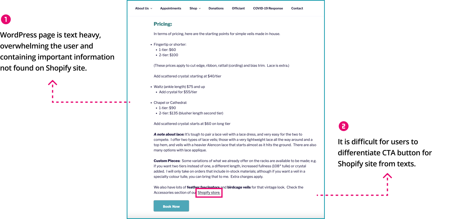
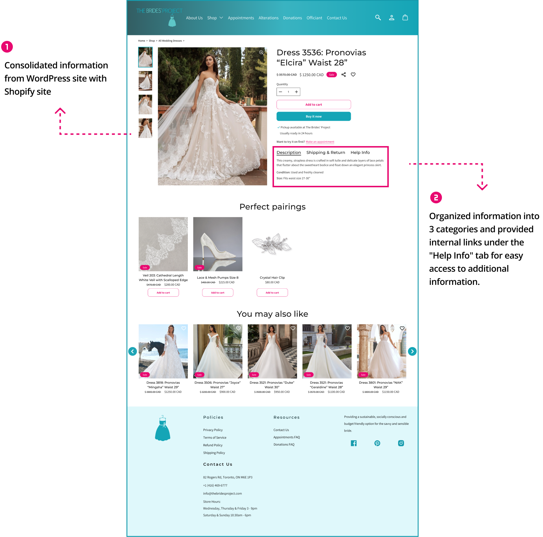
As part of our evaluation, we discovered that the Brides' Project's website operates on both WordPress and Shopify platforms. This presents a significant challenge, as users have reported difficulty locating the shopping page, causing a less-than-ideal shopping experience. To resolve this issue, we seamlessly merged the two platforms into one cohesive website, improving the shopping experience for users.
03/ Evaluation
Referencing Nielsen Norman Group's 10 Usability Heuristics, our team conducted a heuristic evaluation through the task flow, highlighting usability issues and assigning severity ratings based on impact, frequency and persistence.
We then mocked up improved designs for 6 major areas that required improvement.
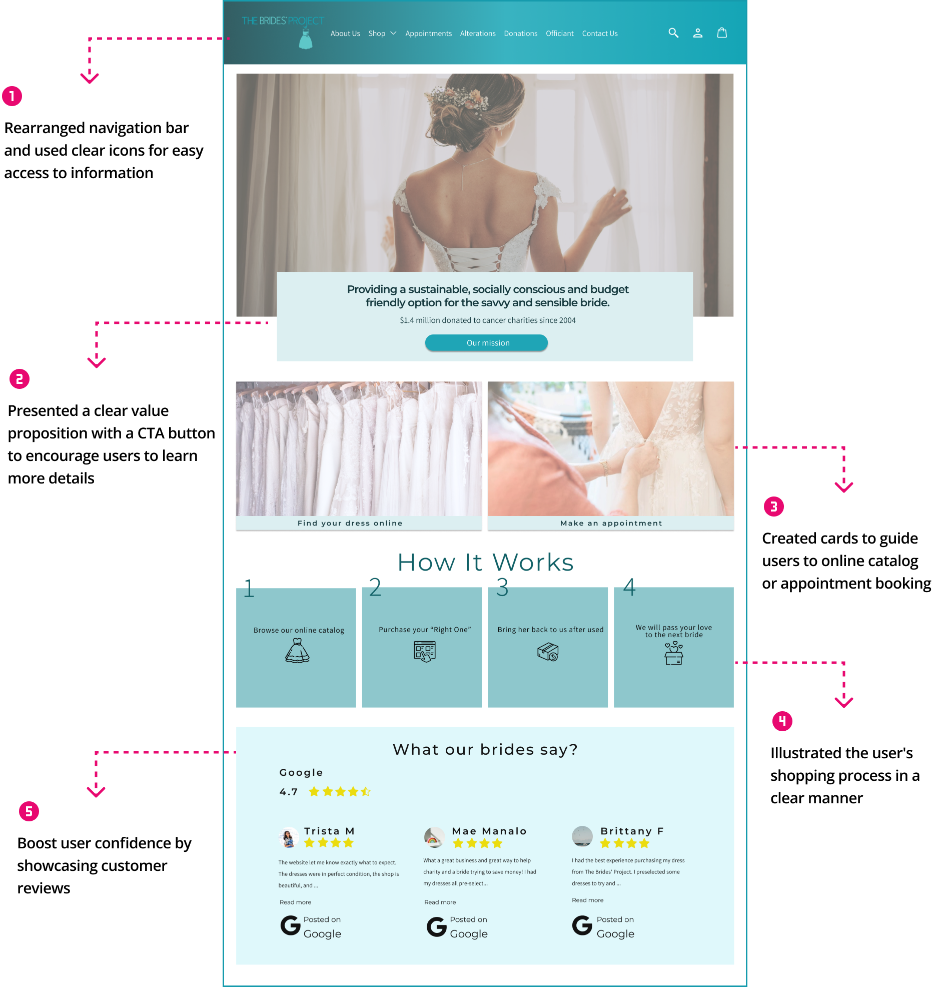
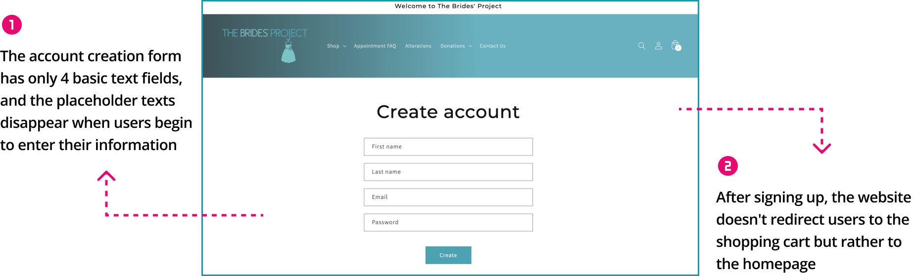
Issue #1: Homepage
Heuristics Violated:
Problems:
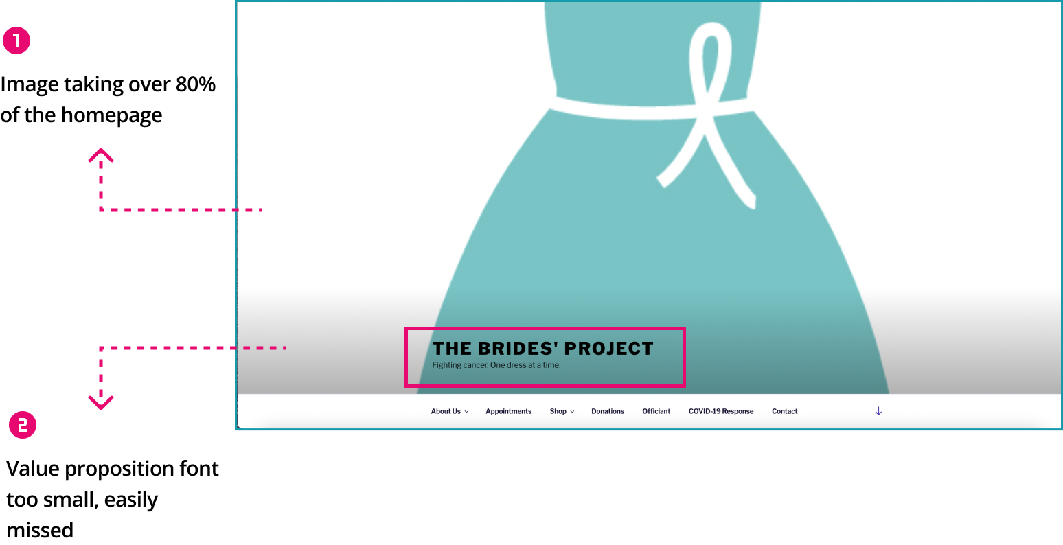
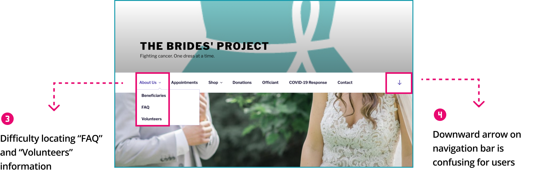
Solutions:
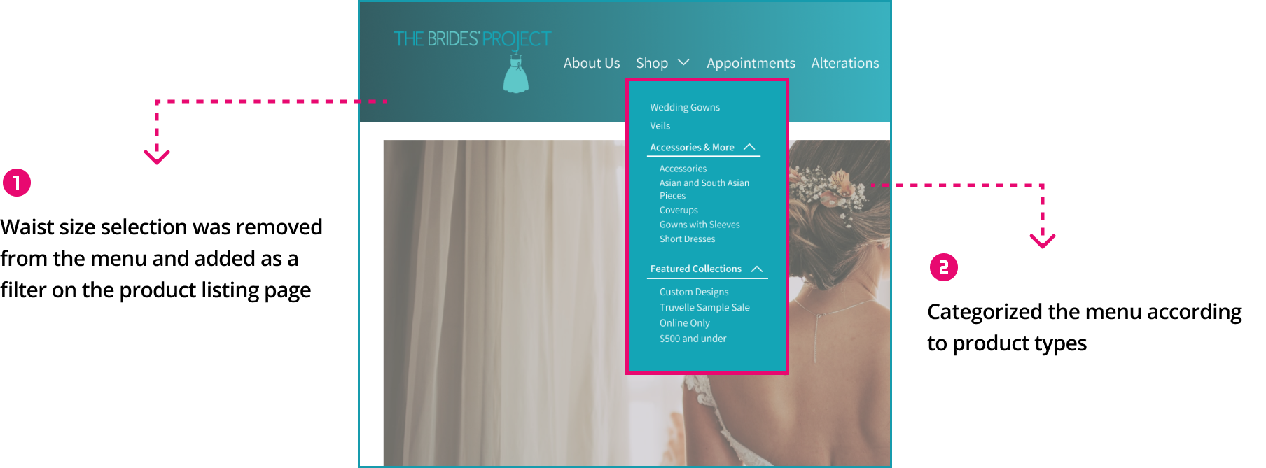
Issue #2: Shop Menu
Heuristics Violated:
Problems:
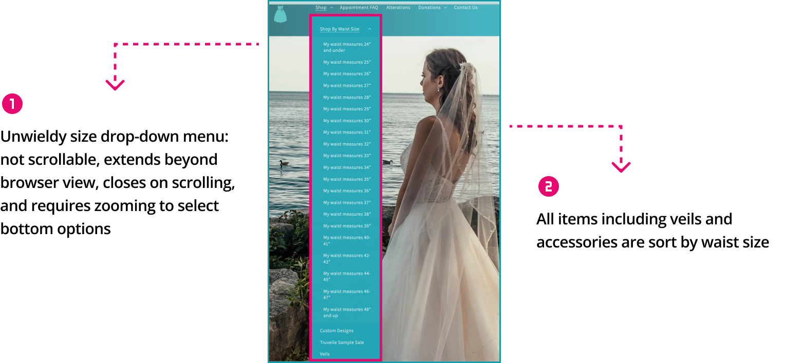
Solutions:
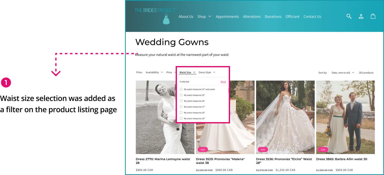
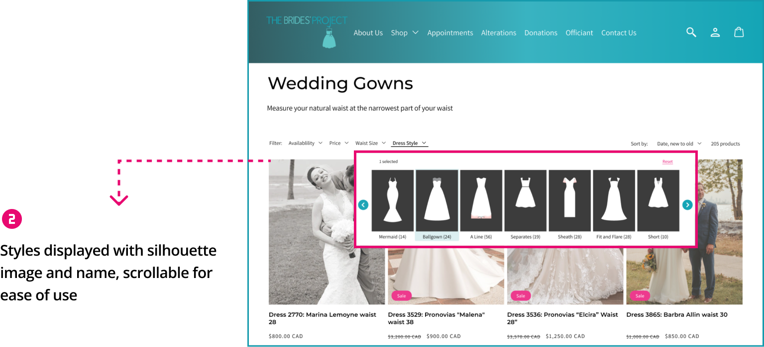
Issue #3: Dress Selection
Heuristics Violated:
Problems:
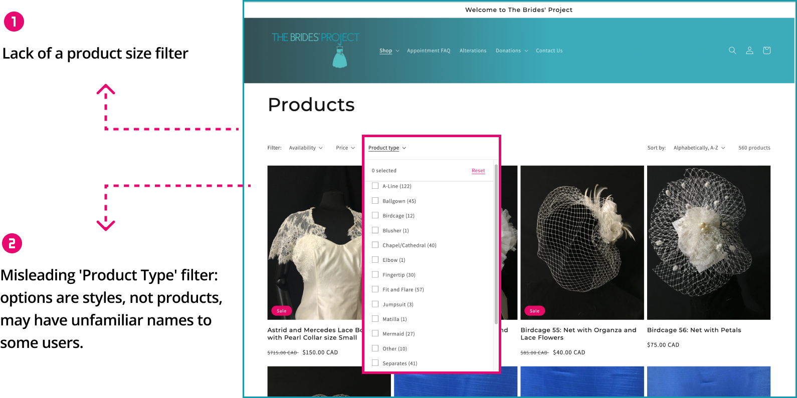
Solutions:
Issue #4: Product Details Page
Heuristics Violated:
Problems:
Solutions:
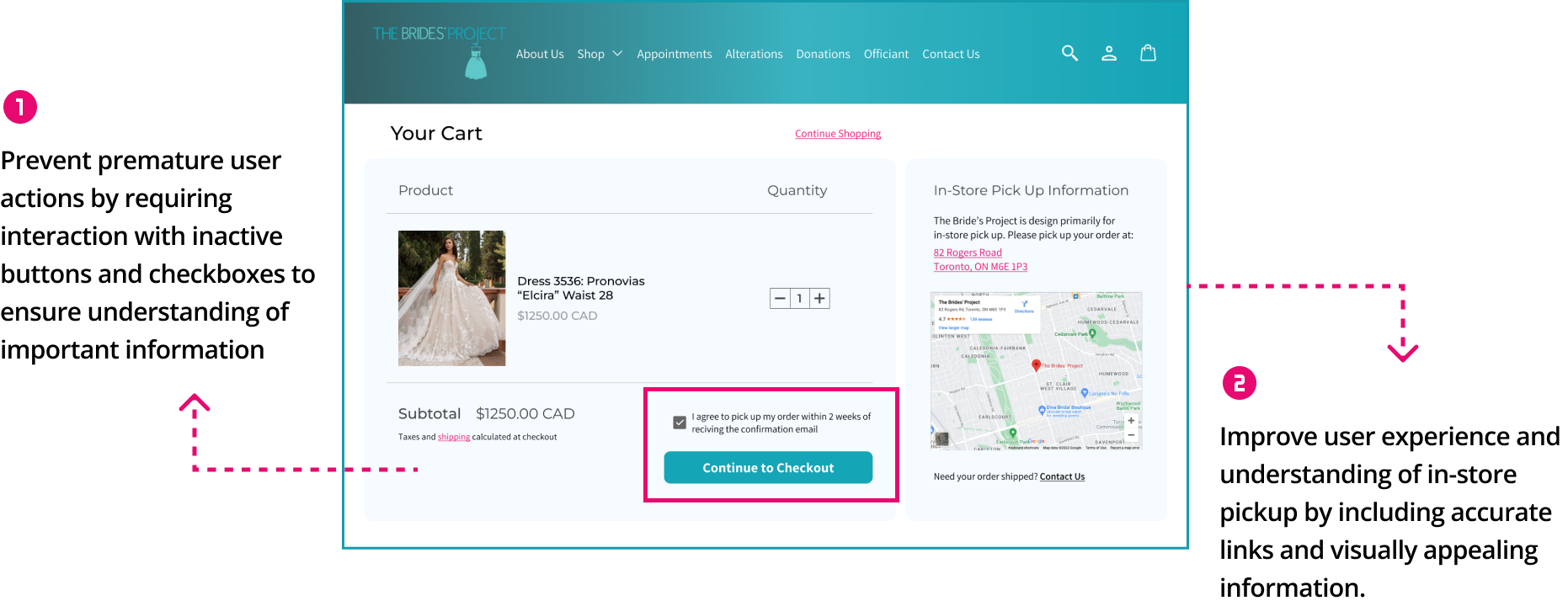
Issue #5: Shopping Cart Page
Heuristics Violated:
Problems:
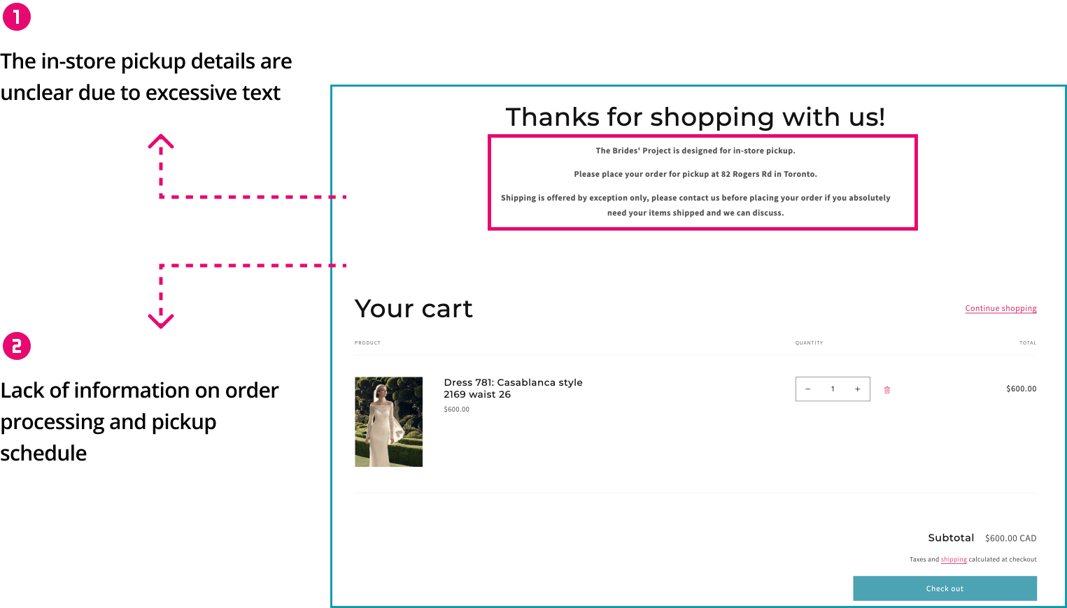
Solutions:
Issue #6: Checkout Page
Heuristics Violated:
Problems:
Solutions:
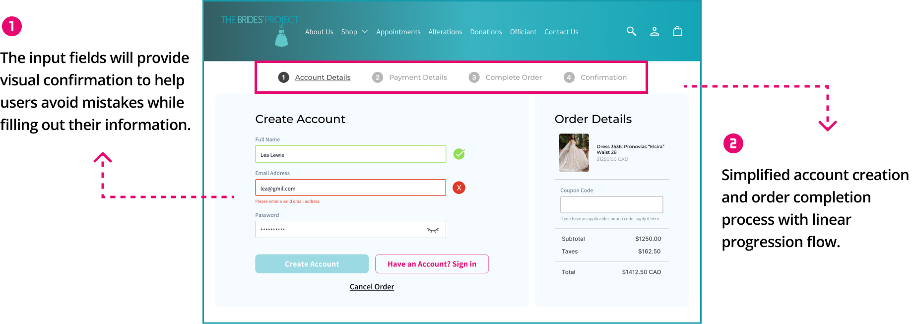
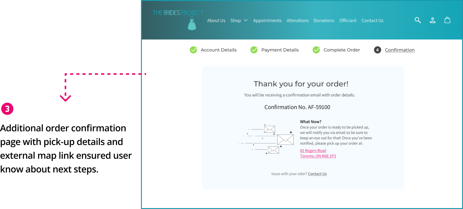
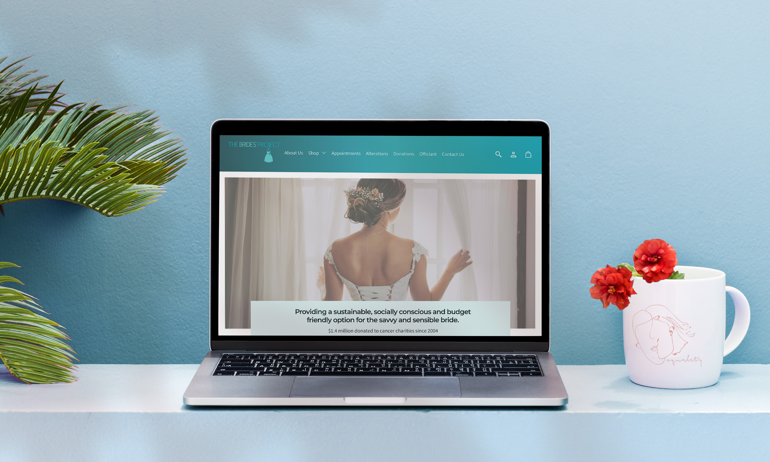
04/ Prototype
05/ Key Learnings
Client Communication
Conducting a heuristic evaluation for an existing organization provided an opportunity to present the findings in an 'agency to client' context.
Prioritize by Severity
Through aggregating our team's findings, we identified major and minor issues with confidence, enabling us to prioritize corrective measures by severity for maximum impact.
Design within Brand Constraints
By following our recommendations for resolving the site's issues, we were able to redesign an existing product while maintaining consistency with the brand's style guidelines.

Interested in working together? Get in touch!

© Cynthia Huang 2022. All rights reserved.